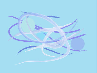
Calm
For this particular image I have chosen to use a various number of soft artistic brushes in Illustrator and also geometric circles with blur effects applied, to the illusion of water and bubbles. The reasoning behind this technique is because I believe that water and bubbles are an effective symbol for calm. I have also chosen to use soft blue tones for the fact that in colour definition the meaning to blue represents calm peace and tranquility (http://www.logocritiques.com/resources/color_psychology_in_logo_design/) Blue tones can have a calming effect on people when looked at, this is why in interior design blue is quite a popular shade in bedrooms and rooms that need to be calming.
Anger
For this design, at the time i was angry. i channeled my emotion into this image and this is what i have come up with. For the background i have used different shades of red. In colour psychology the definition for red is angry and aggressive so this is why i have chosen to use this colour for this particular image (http://www.logocritiques.com/resources/color_psychology_in_logo_design/) For the rest of the image i have used a various number of grunge brushes. I have then drawn over the page with these in an angry fashion so it gives you a 'sharp' abstract confusing design.
Excitement
This image was to communicate the emotion excitement. I started out by using a yellow background which i believe that yellow is an appropriate colour for excitement (http://www.cottagehomedecorating.com/meaning-of-colors.html) I then used geometric rectangles and a large orange oval to create a bright abstract 'sun' like image and a number of brushes placed across the middle of the page. After this i then used the warp and twirl tool to give the illusion of a heart monitor like the ones found the the hospital. i have made the lines look like the person is exited.


No comments:
Post a Comment