Role: Business card designer
For the last couple of weeks we have been designing a logo and various other business stationary for a local cycle shop in the main street of Wagga Wagga called 'Kidsons Cycles.' Once we had all decided on a logo that the client was happy with, everyone in the class were set separate roles to design different implements of stationary.
My role was to design a business card. I chose to do a double sided business card as appose to the old one sided card that made all the information seem crowded. I also used a white and grey background and tied the grey in on the back with a grey sprocket. I also copied the information such as the bike brands and placed them onto the front of the card with just the logo.
Tuesday, 20 September 2011
Advance Features of Computer Applications Test
In illustrator we were given a test to recreate 4 separate images using different tools in illustrator. the top image is the image that we received and the image below are my versions. the 4 tools used were the blend tool, gradient mesh, distort mesh and the perspective tool.
Originals
Mine
Sunday, 18 September 2011
Rapid Logo Study
For this task we were given a name of a fake business 'trident grill' and we were asked to create a hand drawn logo in both color and black and white.we when had to go around the class and give all of the logos a score from 1 to 5, 5 being the highest. the top image are the ones that a created. and the bottom image is the winning logo. i believe mine wasn't the winner because i could have been more creative in my designing.
My logos
Drakies winning logos
Childrens Map
At tafe we were given a task to create a children's map of Australia. we had to illustrate everything by hand in illustrator. this is my final product.
Tuesday, 6 September 2011
Rapid Logo Study
For this task we had to design hand drawn logos for a faux childerens play centre called "Pip-squeaks" we had to draw one coloured logo that we liked and then draw it again in black and white.

The two top images are images of mine that i created and the bottom four image are the ones that won as their was a tie.
I believe mine wasn't the winner because i could have made them more colorful and attractive to the younger children generations.
We then had to score everyones in the class the following are mine and the winning logos.
Mine (Colour)
Mine (Black & White)
Tanias' Logo
Katelyns' Logo
Katelyns' Logo ( Black & White)

The two top images are images of mine that i created and the bottom four image are the ones that won as their was a tie.
I believe mine wasn't the winner because i could have made them more colorful and attractive to the younger children generations.
Monday, 5 September 2011
Business Stationary Project (Hoot Kidswear)
Business Card (Front)
Business Card (Back)
LetterHead
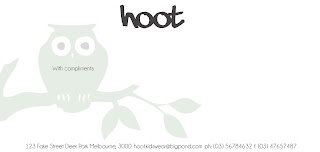
With Compliments
Bad points: move the with compliments text, make the owl lighter and use different types of text eg: italics, bold, etc.
Business stationary project (Mango Creative)
Business Card (Front)
Business Card (Back)
LetterHead
WithCompliments
Bad Points: Make the pink brush used in the with compliments and the letterhead ligher.
Business Stationary project (Smith & Jones Lawyers)
Business Card
LetterHead
With Compliments
Bad points: Make the logo look meaner, use bold and italics
Subscribe to:
Comments (Atom)


