
Sunday, 31 July 2011
Gradient Mesh exercise
In illustrator we were given a tutorial to follow on how to create a gradient mesh. This is my first attempt at a gradient mesh.

Colour Assessment; Colours and Emotions
In Illustrator we have been given our first assessment for semester 2. This assessment was to create 3 separate designs to show each of the different emotions that were chosen for us. The three emotions that were chosen were Calm, Excitement and Anger. the following images are my final products.
Anger


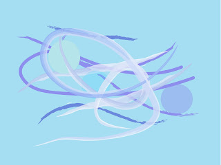
Calm

For this particular image I have chosen to use a various number of soft artistic brushes in Illustrator and also geometric circles with blur effects applied, to the illusion of water and bubbles. The reasoning behind this technique is because I believe that water and bubbles are an effective symbol for calm. I have also chosen to use soft blue tones for the fact that in colour definition the meaning to blue represents calm peace and tranquility (http://www.logocritiques.com/resources/color_psychology_in_logo_design/) Blue tones can have a calming effect on people when looked at, this is why in interior design blue is quite a popular shade in bedrooms and rooms that need to be calming.
Anger

For this design, at the time i was angry. i channeled my emotion into this image and this is what i have come up with. For the background i have used different shades of red. In colour psychology the definition for red is angry and aggressive so this is why i have chosen to use this colour for this particular image (http://www.logocritiques.com/resources/color_psychology_in_logo_design/) For the rest of the image i have used a various number of grunge brushes. I have then drawn over the page with these in an angry fashion so it gives you a 'sharp' abstract confusing design.
Excitement

This image was to communicate the emotion excitement. I started out by using a yellow background which i believe that yellow is an appropriate colour for excitement (http://www.cottagehomedecorating.com/meaning-of-colors.html) I then used geometric rectangles and a large orange oval to create a bright abstract 'sun' like image and a number of brushes placed across the middle of the page. After this i then used the warp and twirl tool to give the illusion of a heart monitor like the ones found the the hospital. i have made the lines look like the person is exited.
Tuesday, 26 July 2011


Sunday, 24 July 2011


Thai Cuisine
In class today we were given a task similar to the last two where we had to communicate a subject without actually using the the words. Todays words to communicate were 'Thai Cuisine.' The first one was to be images, the second images plus text, the third a vector image without text, the fourth vector images plus text and the last as minimal as possible.
The following are my final products.


The following are my final products.


Tuesday, 19 July 2011
Hue, Value and Chroma
Hue: The colour of an image or object. eg: "the hue of her face was bright red"
Value: adding black and white to an image to give us a shade or a tint. eg: adding white to red to give a pink tint, adding black to red to give us a brown shade.
Chroma: The intensity or purity of a colour also known as saturation. eg: reducing the intensity of the shades and tints of the image.
Value: adding black and white to an image to give us a shade or a tint. eg: adding white to red to give a pink tint, adding black to red to give us a brown shade.
Chroma: The intensity or purity of a colour also known as saturation. eg: reducing the intensity of the shades and tints of the image.
Explore the use of colour
In illustrator we have be set a task to choose which colours we believe would work better for different businesses around the Wagga Wagga area.
The Lawson Motel
Colour: Dark/Warm Purple

Reasoning: This motel in Wagga Wagga is classy and sophisticated so i believe that a deep purple and maybe a silver for the writing instead of the gold would look a lot more classy.
This colour is related to sensibility and beauty.
Hungry Jacks

Colour: Yellow and Red

Reasoning: The colours used in the logo i find are working well together. the colours red and yellow are both energetic and draw the eye. Many restaurants use these colours in there logos to they are bight and stand out many people also say that warmer colour like the colour red increase our appetite.
Fitzpatrick Real Estate
Colour: Blue and White

Reasoning: The Fitzpatrick is a local real estate agent. i beleive their logo is using to many colours that makes the logo look over crowded. for this logo i beleive that just the blue that has been used and a white would have a greater impact.
the colour blue represents confidence and loyalty which if you are purchasing a house you want a "loyal and confident" agent.
Crown Computers

Colour: Royal Blue and White

Reasoning: The colours for this logo i believe work well together. again the colours blue and white represent 'loyal, confident and success' because this business is a computer repair business i believe that a confident and successful image is crucial for their reputation.
Matt Jenkins Homes
Colours: Brown and Gold

Reasoning: the reason i have chosen a brown and a gold colour for this logo is because brown is a woody constructive colour and i believe that it would work well for a house construction business. Gold is also a colour that stands for wealth.
Romanos Hotel

Colour: Burgundy/purple and black

Reasoning: i believe the colours of this logo should be a burgundy and black. i have chosen the burgundy colour because it is the colour that they have painted the building. These colours also give the hotel a sophisticated and classy look which can be good for their reputation.
Beyond Blue

Colour: Blue and Grey

Reasoning: the reasons i have picked the blue colour for this is because beyond blue and a helpline for depression and anxiety. the colour blue can represent calm, secure and trustworthy which is a relevant image for a depression helpline, while the they is a soothing colour which represents stability.
World Vision

Colour: Orange and Black

Reasoning: The colours that have been used for this logo i believe are very well thought out. The colour orange relates to High-Spirits and Youth which is relevant to this sponsor group because they help give children with needs over in less wealthy countries high spirits.
Monday, 18 July 2011
Rock 'n' Roll Exercise
In photoshop we were set a task to produce 5 images that communicates the words Rock 'n' Roll.
The first image was to just communicate Rock 'n' Roll without using any text what so ever. the second was an image communicating Rock 'n' Roll and using text. the third was a vector based image with no text. the fourth was a vector based image using text and the last one was an image with minimal but still communicating Rock 'n' Roll. The catch with all these images was that we were not allowed to use the word Rock 'n' Roll at all throughout the exercise.The following are mine...


Circus Exercise
In photoshop we were set a task to produce 4 images that communicates the word circus.
the first image was to just communicate circus without using any text what so ever. the second was an image communicating circus and using text. the third was a vector based image with no text and the fourth was a vector based image using text and the last one was an image with minimal but still communicating circus. The catch with all these images was that we were not allowed to use the word circus at all throughout the exercise.
The following are mine.


Subscribe to:
Comments (Atom)